How to Create Pivot Tables from Airtable Linked Records
Pivot tables let you create cross-tabulation grids directly from your Airtable linked records - perfect for compliance reports, demographic analysis, inventory matrices, and any document that needs data summarized by rows and columns.
Overview
A pivot table takes your linked records and automatically:
- Groups rows by a field you choose (e.g., Occupational Level, Product Category)
- Creates dynamic columns from a field's values (e.g., Race, Status, Size)
- Counts or sums records for each row-column intersection
- Adds a totals row at the bottom with column totals and a grand total
You can also group columns under headers for 2-level cross-tabulation (e.g., Race columns grouped under Male/Female).
Available in: Template Builder (HTML templates only)
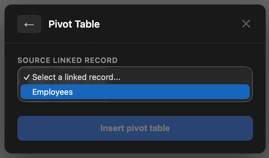
Step 1: Insert a Pivot Table
- Open your template in the Template Builder
- Click the Table button in the toolbar
- Select Pivot Table from the options
- Choose your Source linked record - this is the linked field that connects to the records you want to pivot
- Configure the pivot:
- Row field: The field to group rows by (e.g., Occupational Level)
- Column field: The field whose values become dynamic columns (e.g., Race) - must be a Single Select or Single Line Text field
- Group columns by (optional): Creates 2-level headers by grouping columns under this field (e.g., Gender)
- Operation: Count (number of records) or Sum (total of a numeric field)
- Value field: If using Sum, select the numeric field to sum

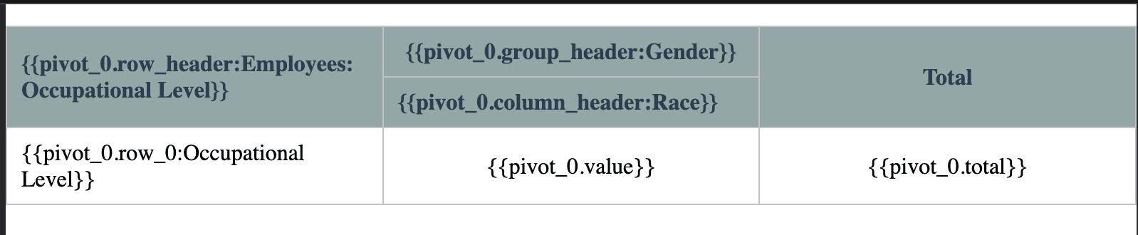
- Click Insert pivot table
The template will show a table with placeholder variables that TypeFlow fills at generation time:
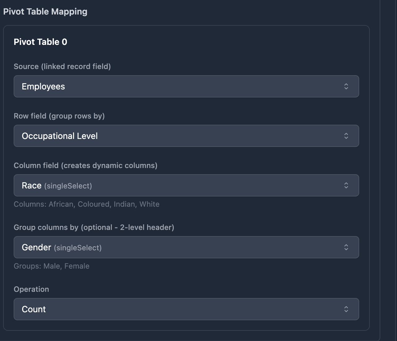
Step 2: Configure the Mapping
After inserting the pivot table and clicking "Refresh variables", go to the Mapping tab. The pivot table configuration appears under Advanced Features > Pivot Table Mapping.
TypeFlow auto-maps the fields based on the hints you set in the wizard. You can also change the configuration here:
- Source: The linked record field from your main table
- Row field: Which field to group rows by
- Column field: Which field creates dynamic columns
- Group columns by: Optional - groups columns under headers
- Operation: Count or Sum
- Value field: The field to sum (if using Sum)
Grouped Column Headers
For reports that need 2-level column headers (like Employment Equity reports or demographic breakdowns), use the Group columns by option.
Example: An EE Workforce Profile report with:
- Row = Occupational Level
- Column = Race (African, Coloured, Indian, White)
- Group = Gender (Male, Female)
Here is a real example of a generated EE Workforce Profile report using grouped columns:
Employment Equity Report - Workforce Profile
The group field must be a Single Select or Single Line Text field. It appears only when a column field is selected.
Use Cases
Employment Equity Reports (South Africa)
- Row: Occupational Level
- Column: Race
- Group: Gender
- Operation: Count
Inventory Matrix
- Row: Product Category
- Column: Size
- Operation: Sum on Quantity field
Sales by Region and Quarter
- Row: Sales Rep
- Column: Quarter
- Group: Region
- Operation: Sum on Revenue field
Survey Results
- Row: Question
- Column: Rating (1-5)
- Operation: Count
Related Features
- Line Items - For simple repeating rows from linked records (one row per record). Use line items when you need a list, use pivot tables when you need cross-tabulation.
- Conditional Sections - Combine with pivot tables to show or hide entire sections based on field values.
- Template Builder - The visual editor where you insert and design pivot tables.
- Dynamic Images - Add logos or charts alongside your pivot tables.